MacroMedia
BRAND IDENTITY
Bespoke Real Estate Photography
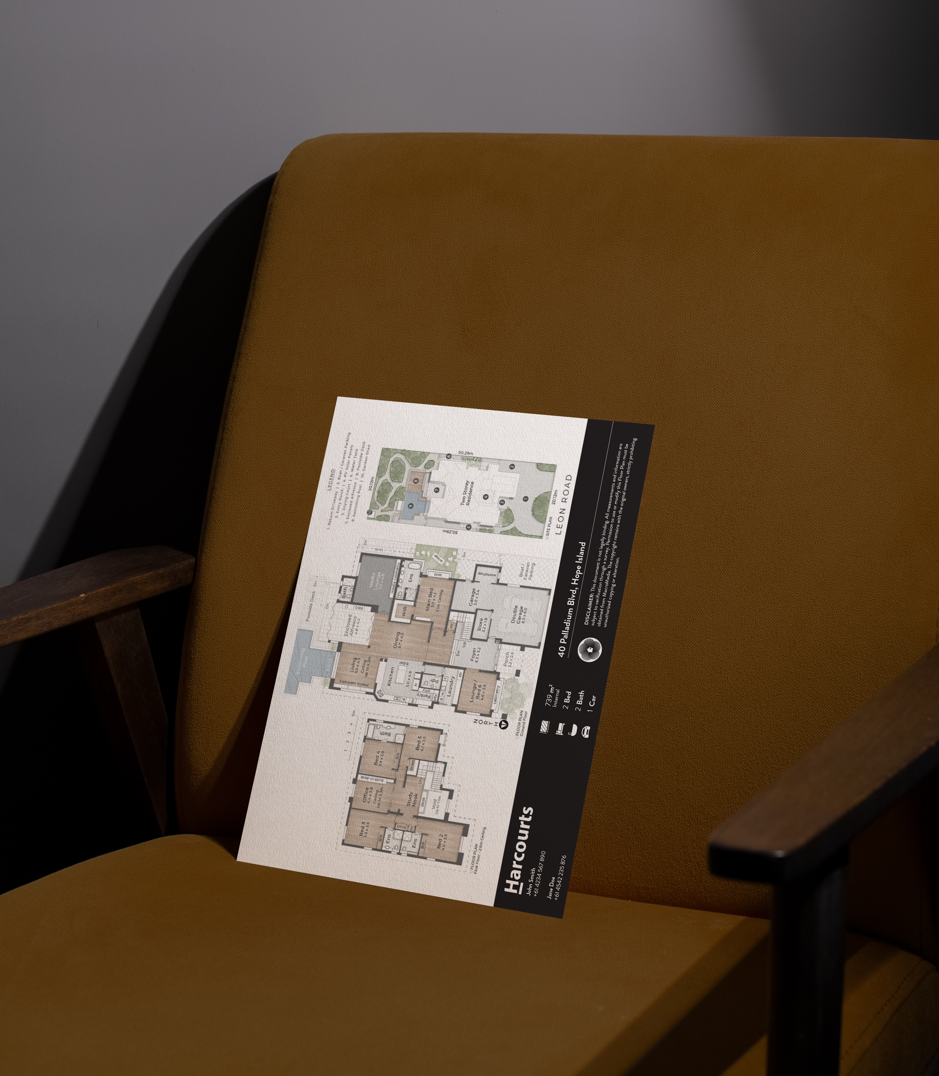
MacroMedia is pioneering a specialized service within the niche real estate photography market in the Meanjin (Brisbane) area. They provide full scale real estate property photography & video content as well as floor plan schematic diagrams.
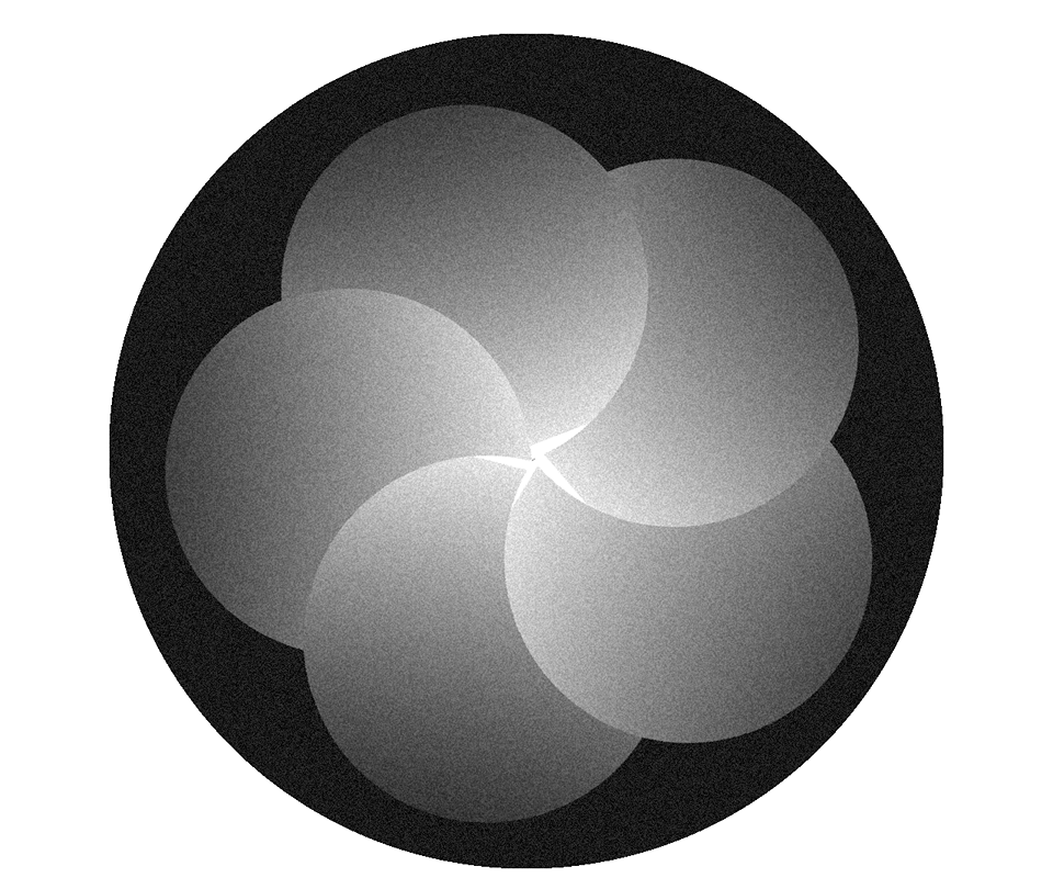
The brand concept for the business was to bring forth unparalleled expertise and innovation. The MacroMedia logo fuses two symbolic elements: a camera lens shutter and a house, representing both the tools and the subject of the business. This hybrid mark captures the company’s dual identity — a media service provider with a sharp focus on real estate
The lens is constructed from a radial arrangement of five circles, mimicking both the structure of a camera shutter and the five points of a simplified house silhouette. At the center, the house element is placed deliberately to represent the aperture — the core focus of the brand — conveying the idea that the home is always at the center of the shot.
Seen as a whole, the icon evokes an iris, subtly telling clients: we have the right eye for the job. This interpretation reinforces MacroMedia’s positioning as a company with a sharp visual instinct and a clear perspective in the property market.
︎︎︎
Bespoke Real Estate Photography
MacroMedia is pioneering a specialized service within the niche real estate photography market in the Meanjin (Brisbane) area. They provide full scale real estate property photography & video content as well as floor plan schematic diagrams.
The brand concept for the business was to bring forth unparalleled expertise and innovation. The MacroMedia logo fuses two symbolic elements: a camera lens shutter and a house, representing both the tools and the subject of the business. This hybrid mark captures the company’s dual identity — a media service provider with a sharp focus on real estate
The lens is constructed from a radial arrangement of five circles, mimicking both the structure of a camera shutter and the five points of a simplified house silhouette. At the center, the house element is placed deliberately to represent the aperture — the core focus of the brand — conveying the idea that the home is always at the center of the shot.
Seen as a whole, the icon evokes an iris, subtly telling clients: we have the right eye for the job. This interpretation reinforces MacroMedia’s positioning as a company with a sharp visual instinct and a clear perspective in the property market.
︎︎︎